
WSJ The Trust x JetBlue
4th District treatment
Travel is one of the great pleasures and adventures of the human experience. Exploring the world around us often helps us to find something within ourselves. JetBlue’s elevated first class experience ensures that every trip, whether for work or for leisure, is a rejuvenating and relaxing event that brings us back to the best of travel.
It is no accident that JetBlue is the standard of premium domestic airlines. Methodical design philosophy, invisible labor, and dedicated time investment are the unsung pillars of JetBlue’s seamless experience. In this piece, we want to highlight the care that lives within JetBlue’s first class ecosystem. This piece will be a visual meditation driven by calming, polished, and informational visuals. Thank you for your trust; we can’t wait to work.
Joshua Pei and the 4th District Team
INTRO
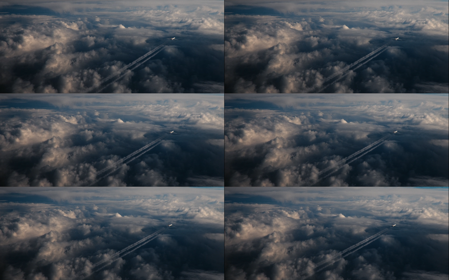
Our vision for this piece is to inform audiences on the deeply intentional design of the BlueFirst experience, while also immersing them in a soothing visual landscape that mirrors the relaxing quality of the actual experience. The visual quality, sound design, and pacing should feel sleek and sophisticated, but grounded in educating rather than a purely commercial feel.
We want to harness the passion and effort that the real designers put into their work to connect with audiences and humanize the flight experience beyond what’s visible from the cabin alone. As the designers share their ideation and design process, the cabin feels more and more like a lived-in manifestation of the JetBlue team’s thoughtful craft.
Ultimately, we hope viewers walk away with a greater appreciation for the hard work that is required to deliver an exceptional experience. And with a stronger curiosity to live that exceptional experience for themselves.
Approach
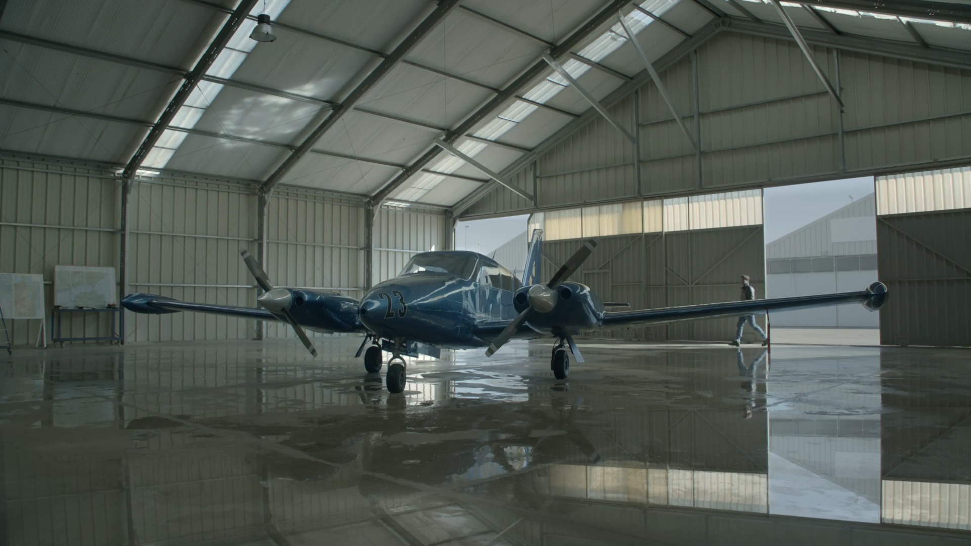
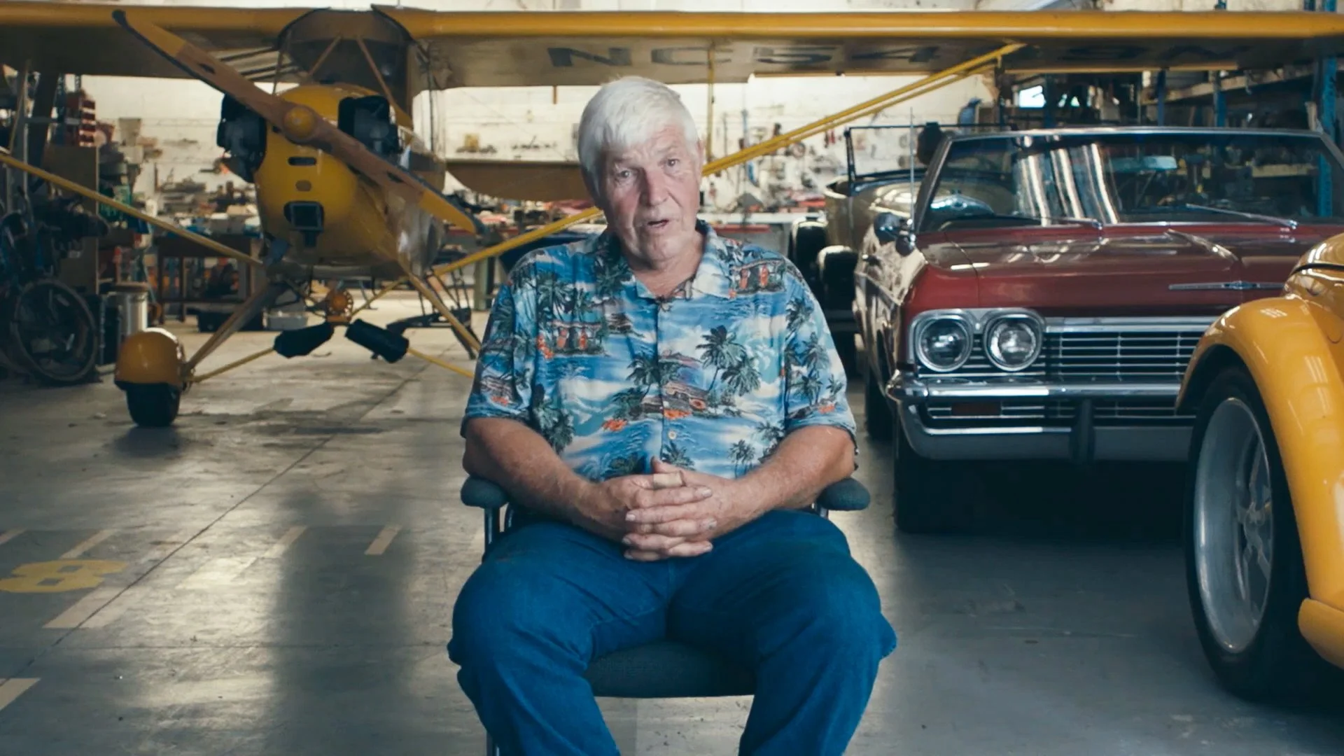
The space in which we meet our SME's sets the stage for our piece. Whether its displaying materials used in production, diving into miniatures, or simply building an engaging and relevant world around our talent, the space is key. Our focus is on educating and illustrating viewers on the work that goes into JetBlue’s new recliner seat developed by Collins Aerospace, as well as the updated overall cabin experience. As such, it feels fitting for us to have our SMEs deliver their message within an airplane hanger or similar open space. A hanger signifies the starting point of a flight’s journey, which aligns perfectly with a SME describing the life cycle of developing this new chair and cabin experience.
look and feel | THE DRAFTING ROOM
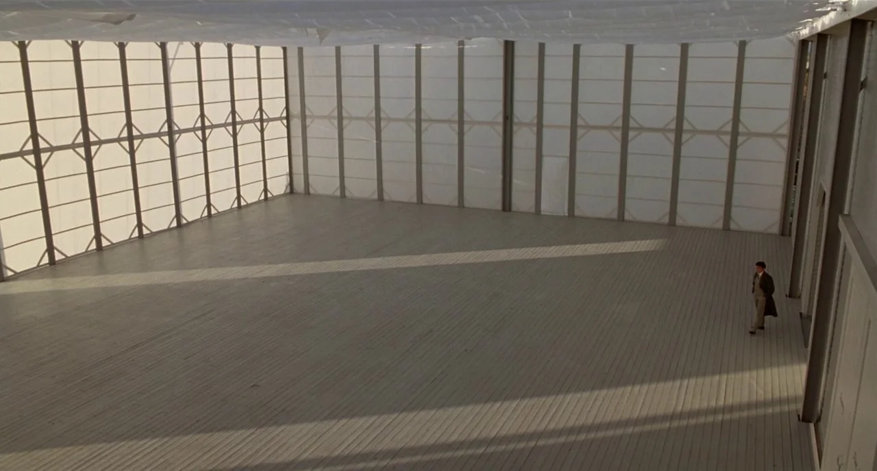
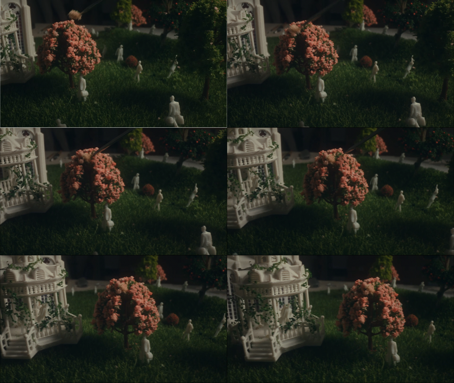
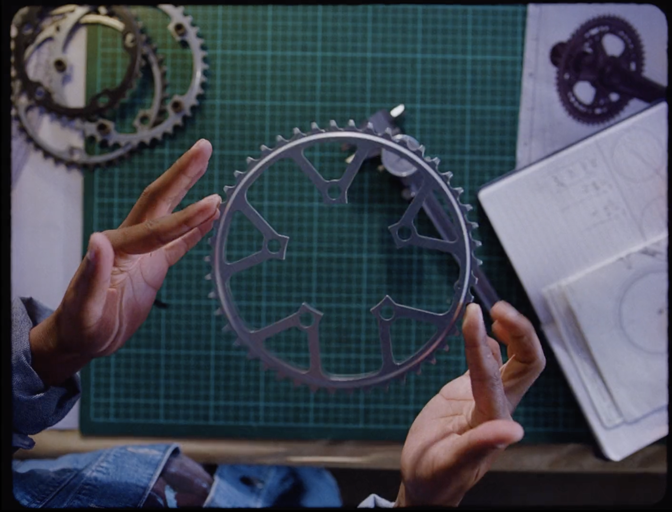
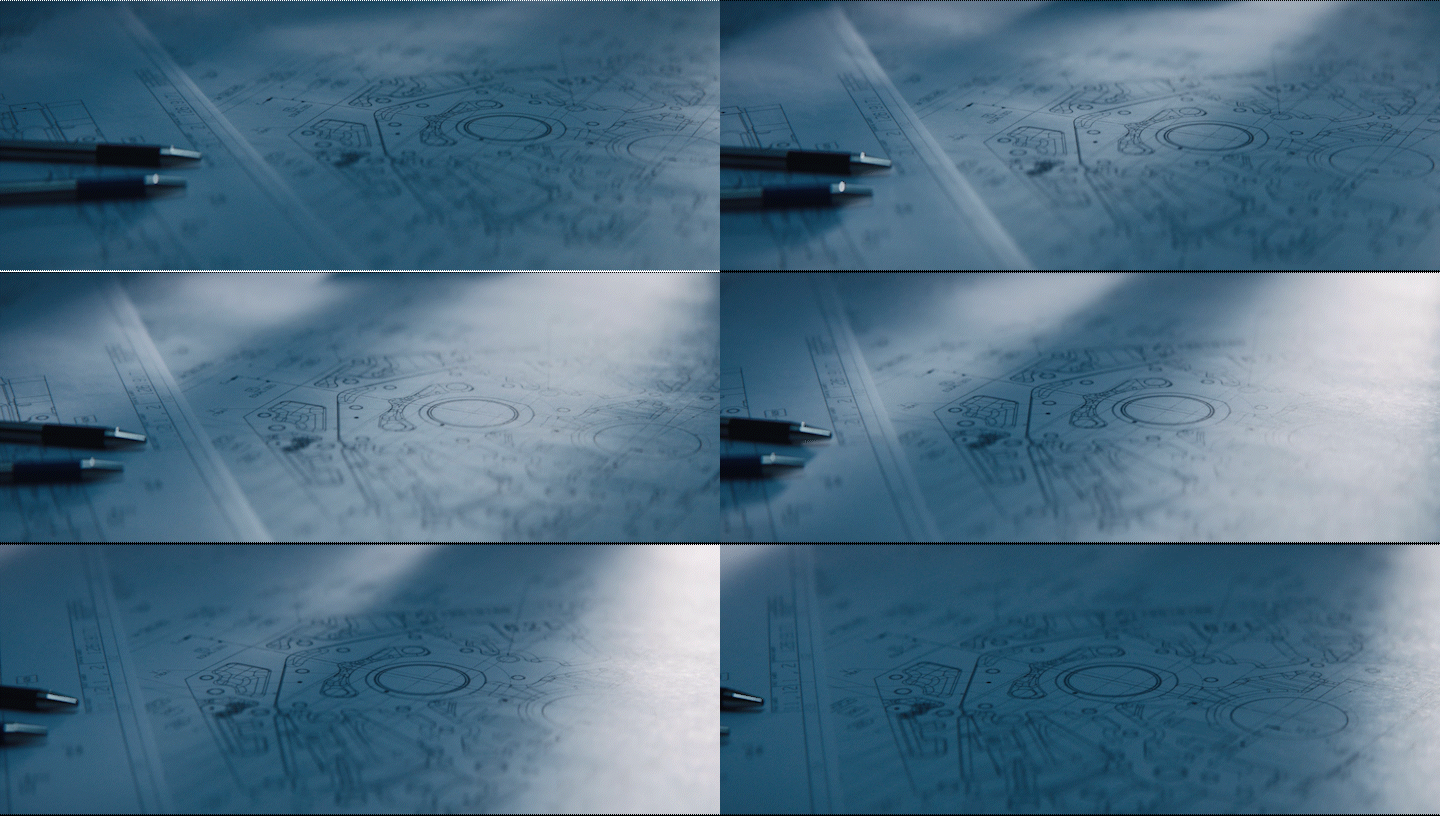
For our SME talking head setup, we will lean into closeups and textures of the models and materials used. Being close allows us to parallel the attention that was given into the design of the new JetBlue experience. We will juxtapose these with grand wide angle shots of the talent seated inside of the hanger when the topic of conversation shifts towards higher level ideas such as flight experience, increased seating space, etc.
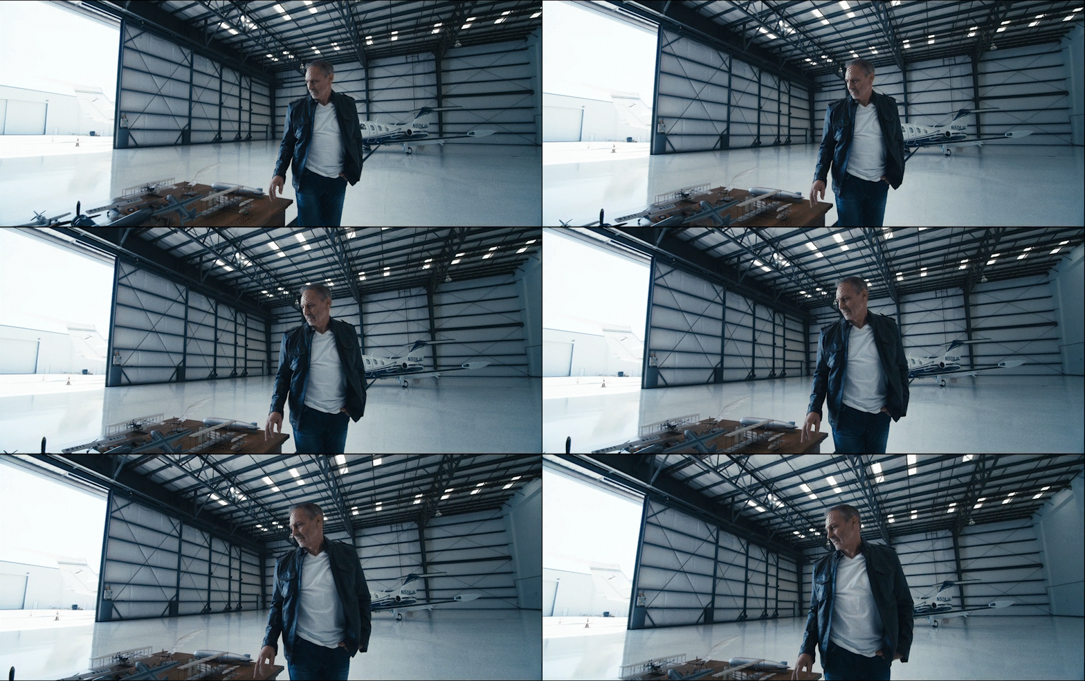
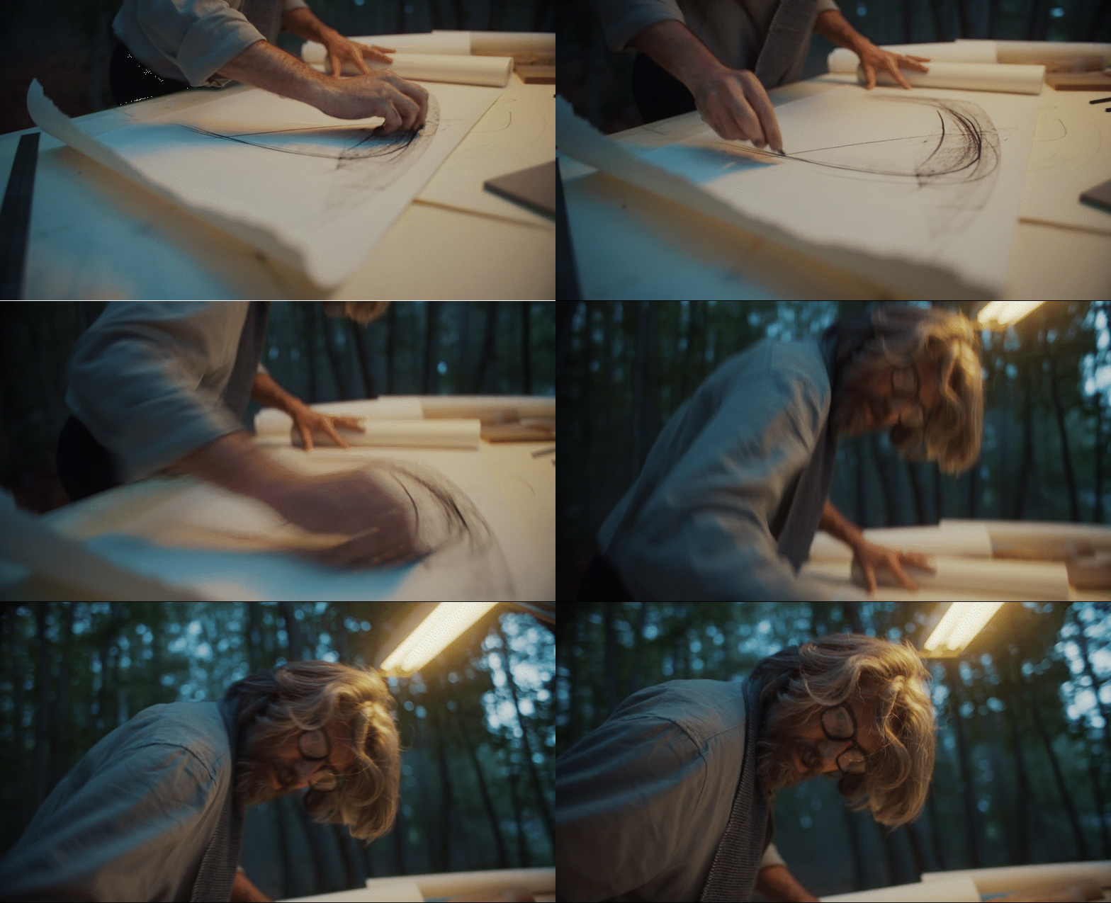
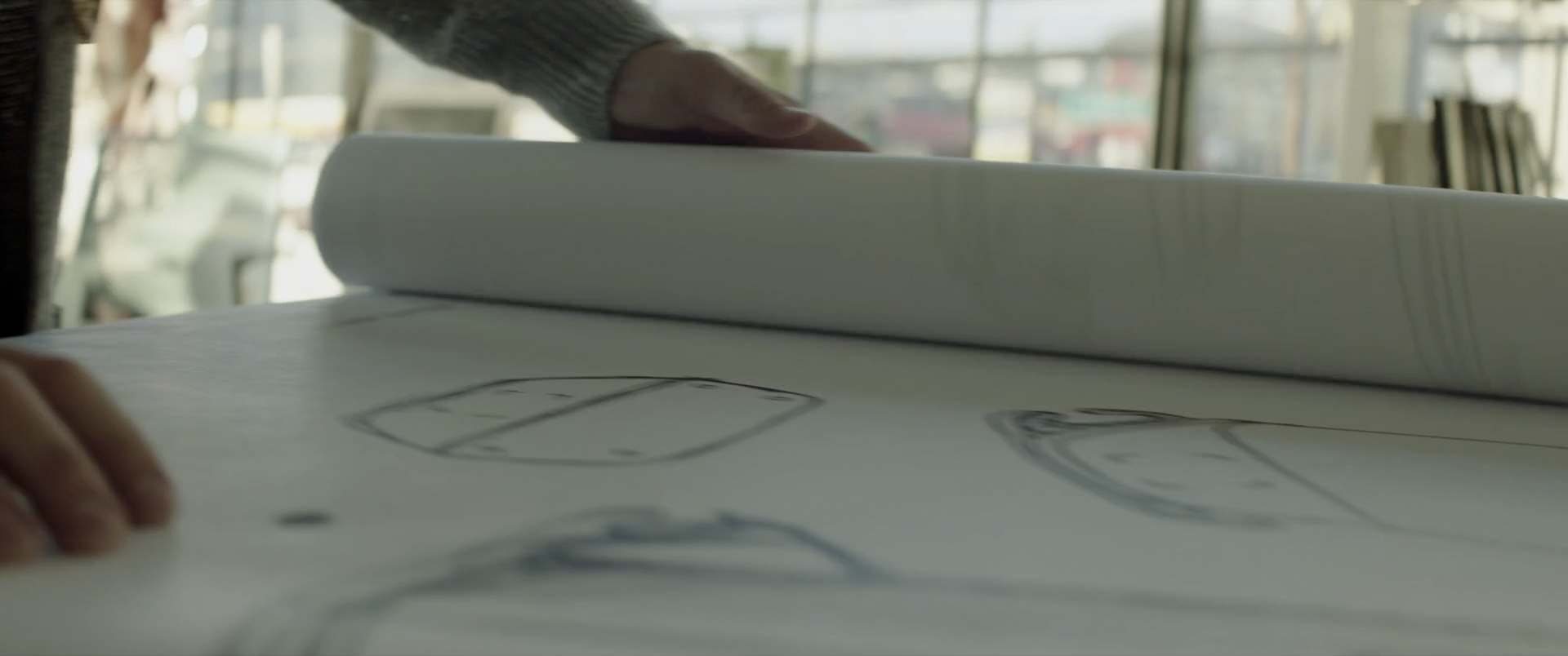
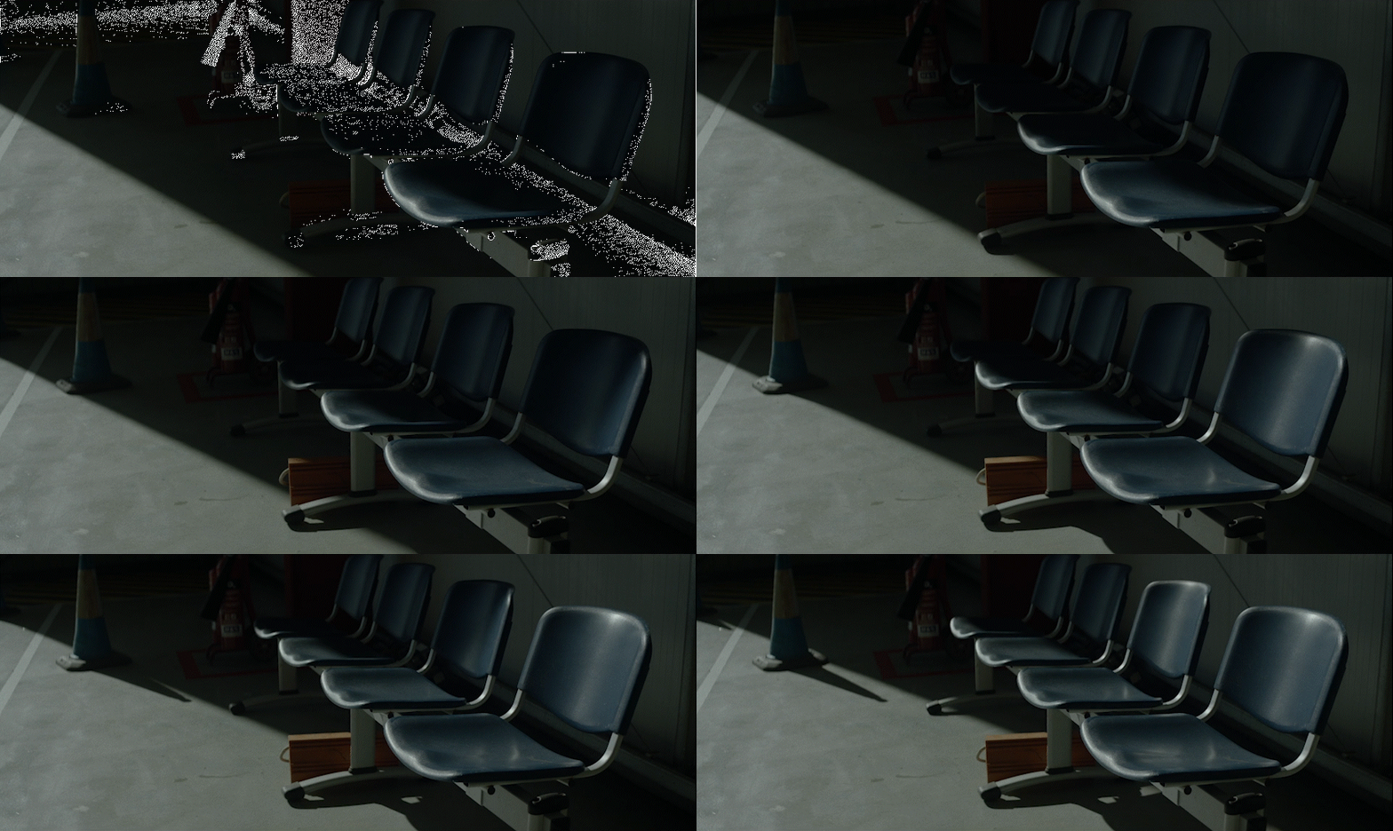
For our hanger, we want an emphasis on a space that feels open and utilitarian. We will preserve a controlled level of shadows and contrast to make the scene feel engaging without being overly dramatic.
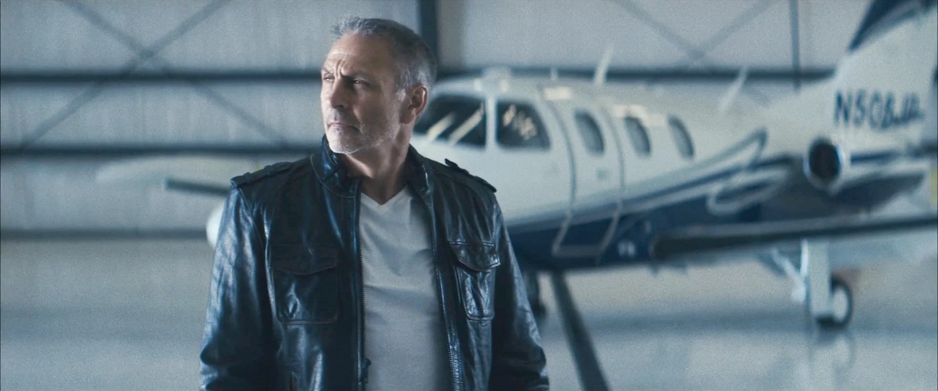
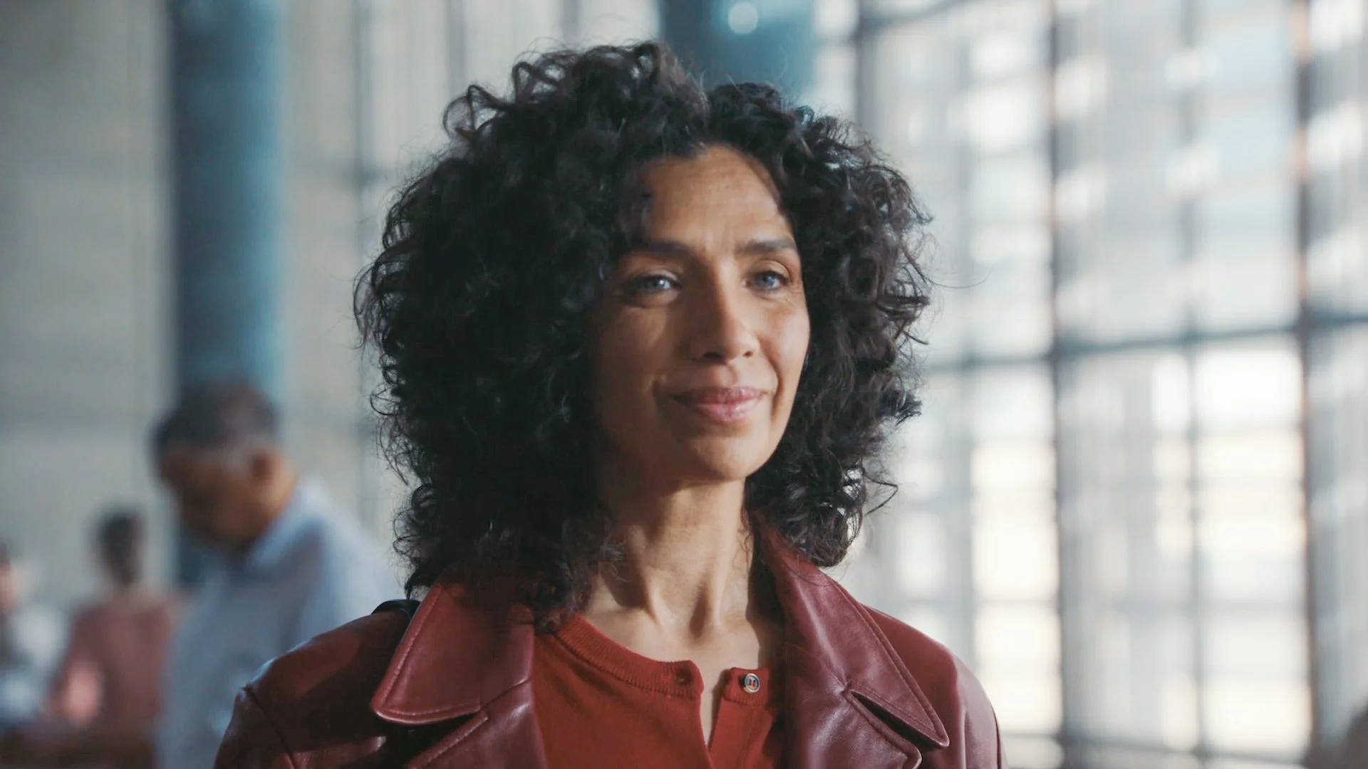
Lighting on our subjects is shaped, while still remaining friendly and approachable. Color contrast is is restrained, and subjects are lit with flattering soft light.
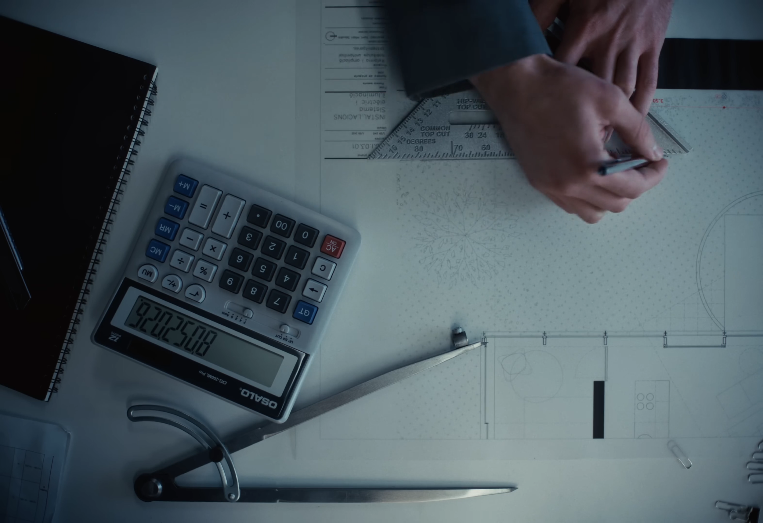
To bring viewers further during our talking head portions, we plan to use overheads and dolly close up movements that follow our talent as they pour over the reflection of work in front of them. We would love to experiment with both handheld and dolly movements in these moments of explanation depending on the nature of the topic.
look and feel | onboard
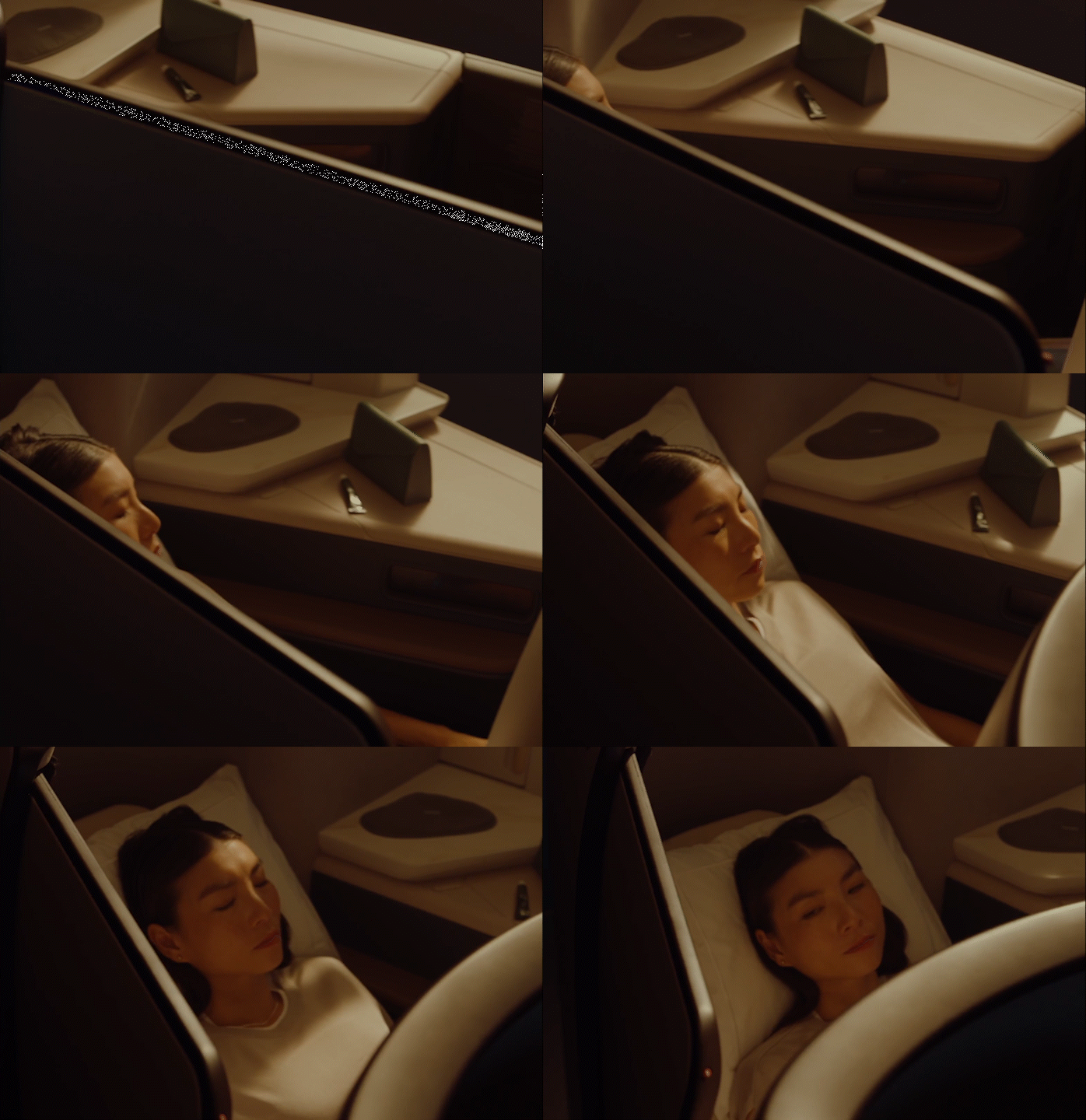
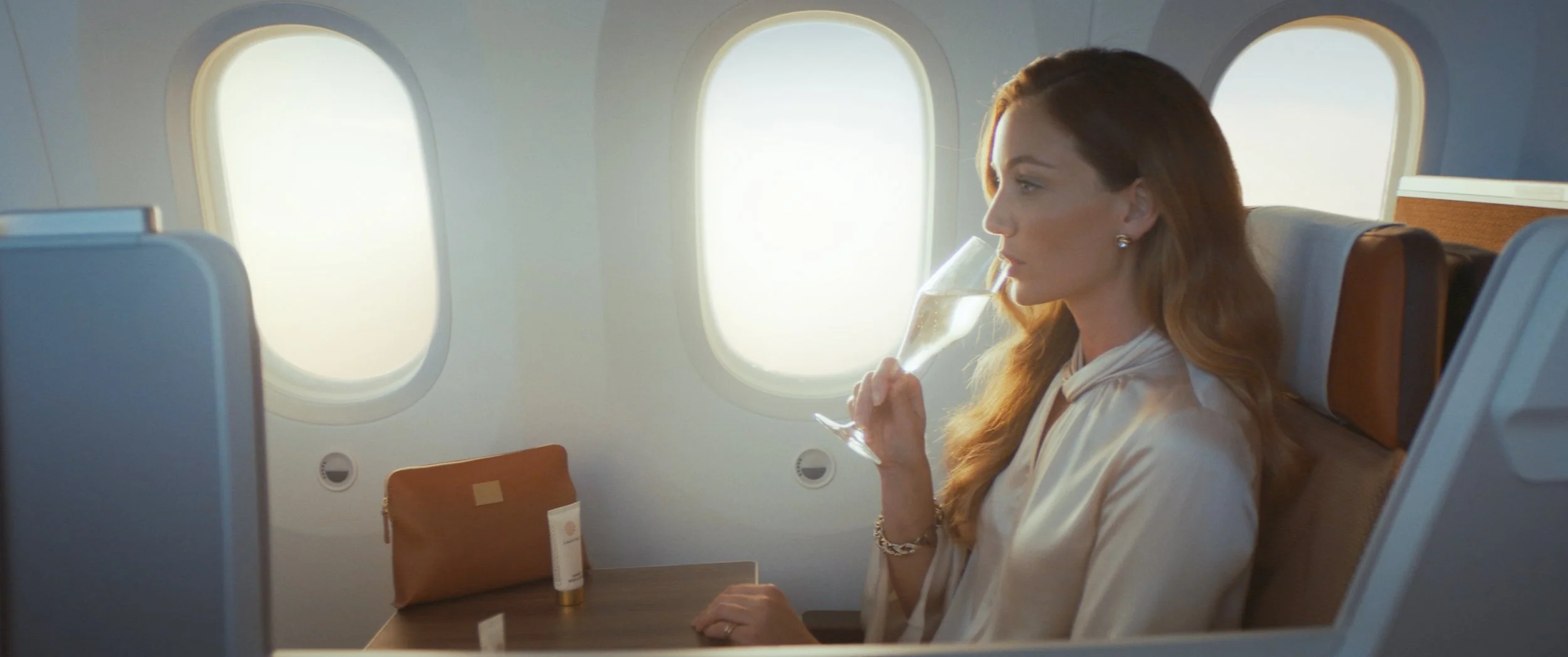
Nailing the on-board documentation is critical to translate the designer’s work into a tangible reality that viewers want to experience for themselves. Using a mix of solo seat shots and talents interacting with the seats, we’ll bring the first class experience to life.
Lighting should feel consistent with the hangar/drafting room scene so they intercut seamlessly. This means the visual tone remains in a polished world with soothing smooth contrast and cool-neutral tones. Saturation is restrained for a clean color aesthetic.
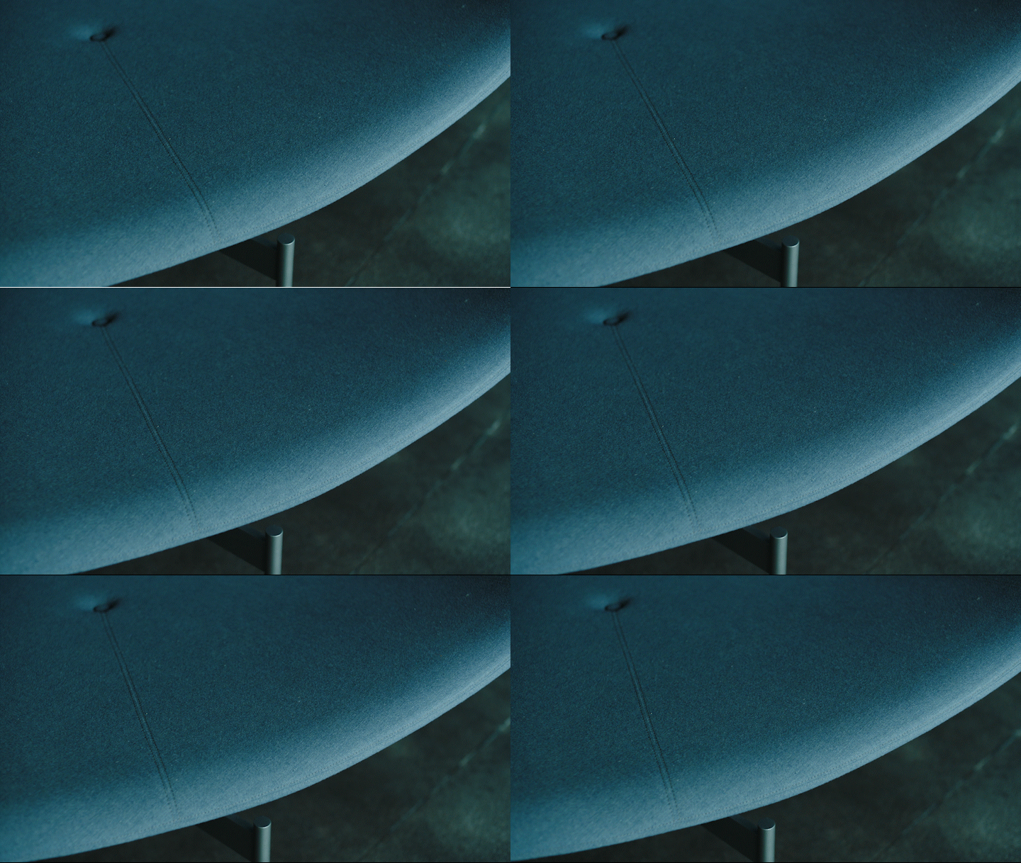
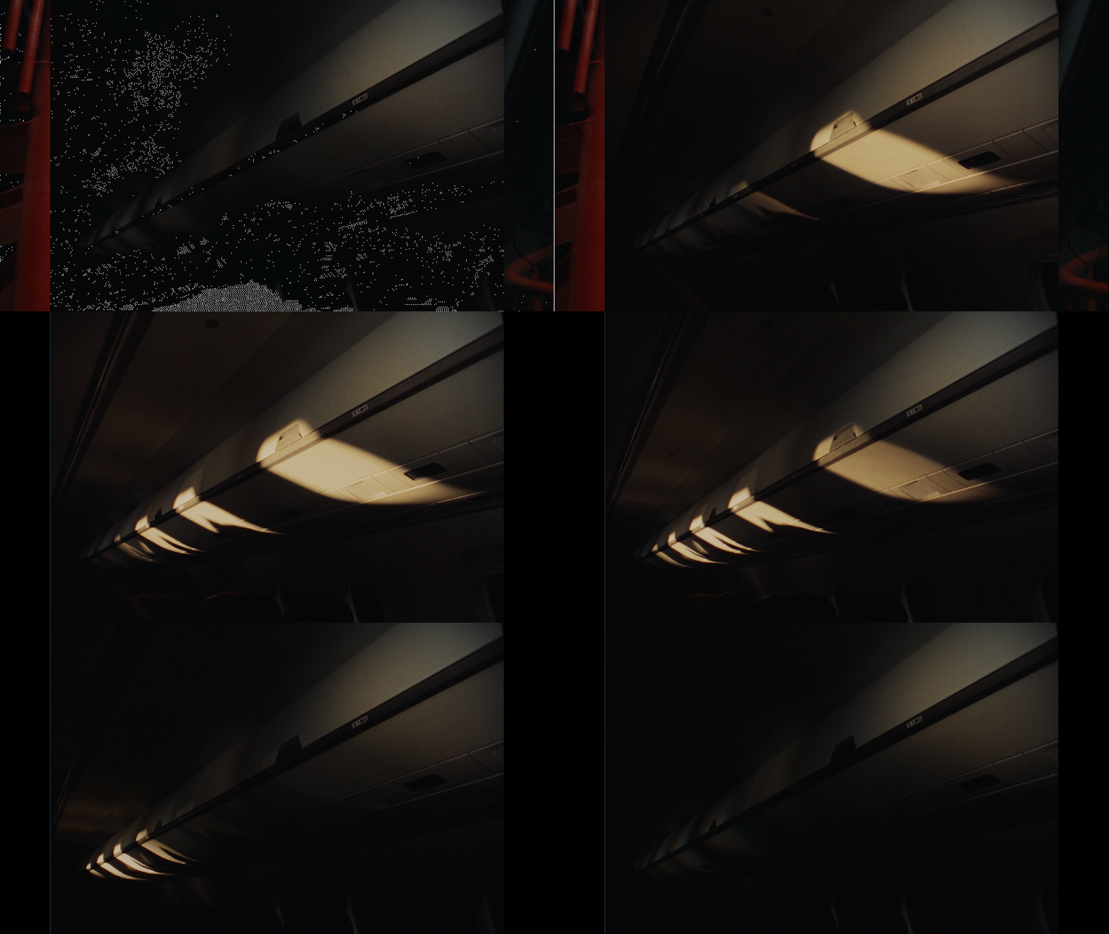
Carrying on the close ups from the hangar, we feature the textures and features of the seat and first class experience. We envision using probe lenses and lighting queues to bring the static seat to life in a more dynamic way. Using these techniques, we can make the seat feel a little larger than life—almost like a landscape. Including 1 or 2 talent in the scene can also aid in illustrating the comfort and seamless quality of the first class experience.
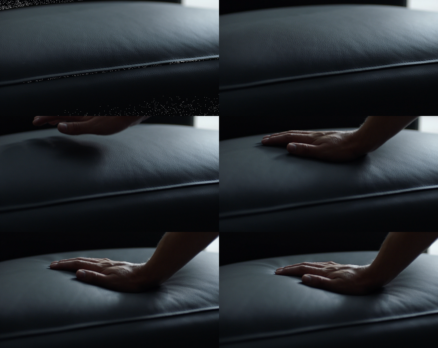
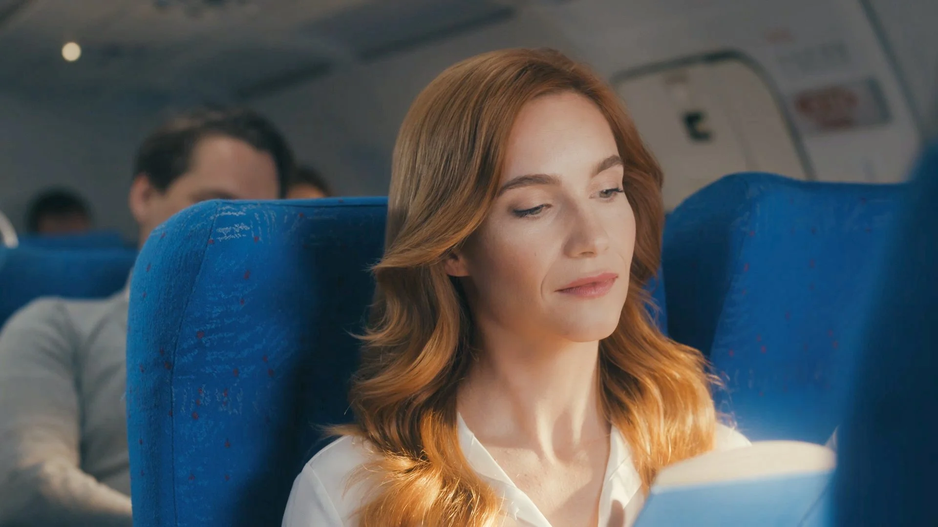
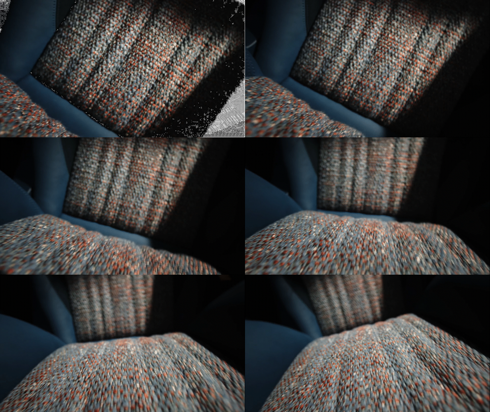
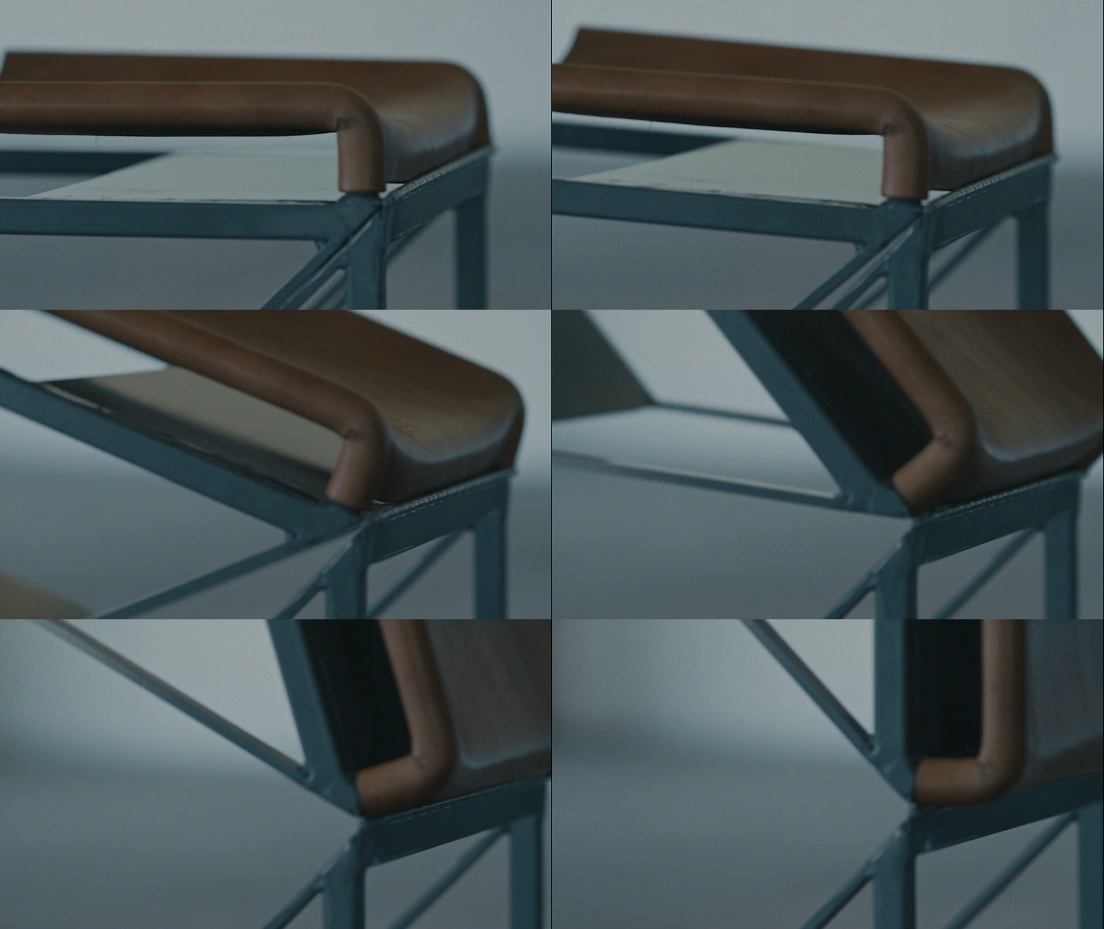
In order to emphasize the polished design of elements in the BlueFirst cabin, we hope to use lighting cues to highlight the textures and contours of various seat and cabin elements. If we’re able to isolate the seat or other elements, we can shoot in a studio environment to create dynamic lighting effects. When shooting in the real plane cabin, we could rely on the lighting design and dynamic shifts that the crew would transition through during a real flight.
look and feel | GRAPHICS
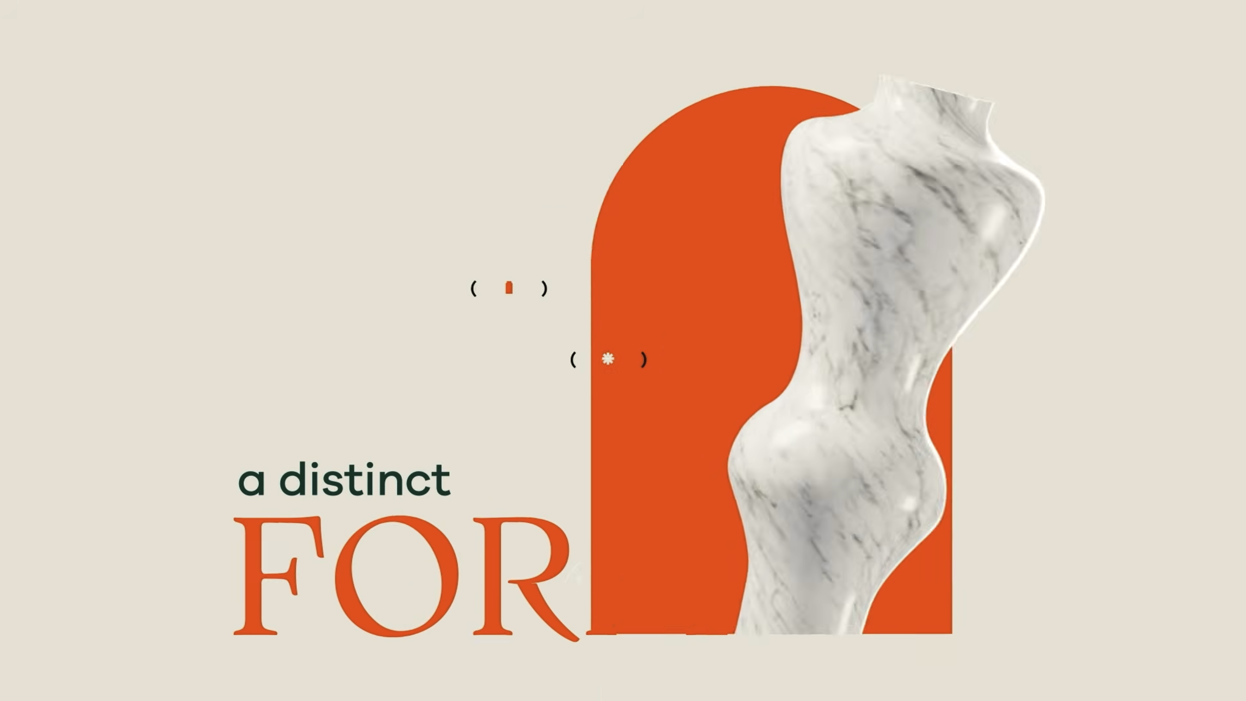
We want our animations and graphics to embody the same elevated, naturalistic, and informative form that our cinematography does. Thus, we want to lean into hand drawn lines and cursive text. Symmetry and perfection aren’t our focus, rather we want to feel the same care and feel that has been put into JetBlue’s experience in our graphical elements.
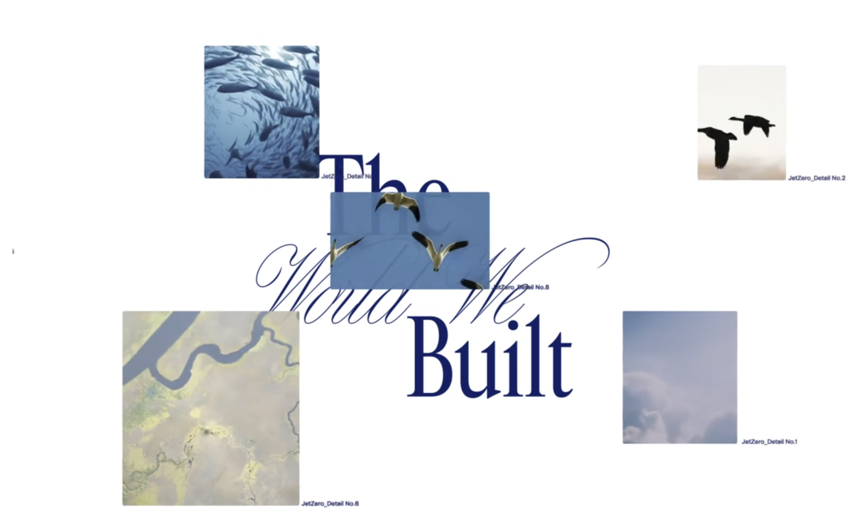
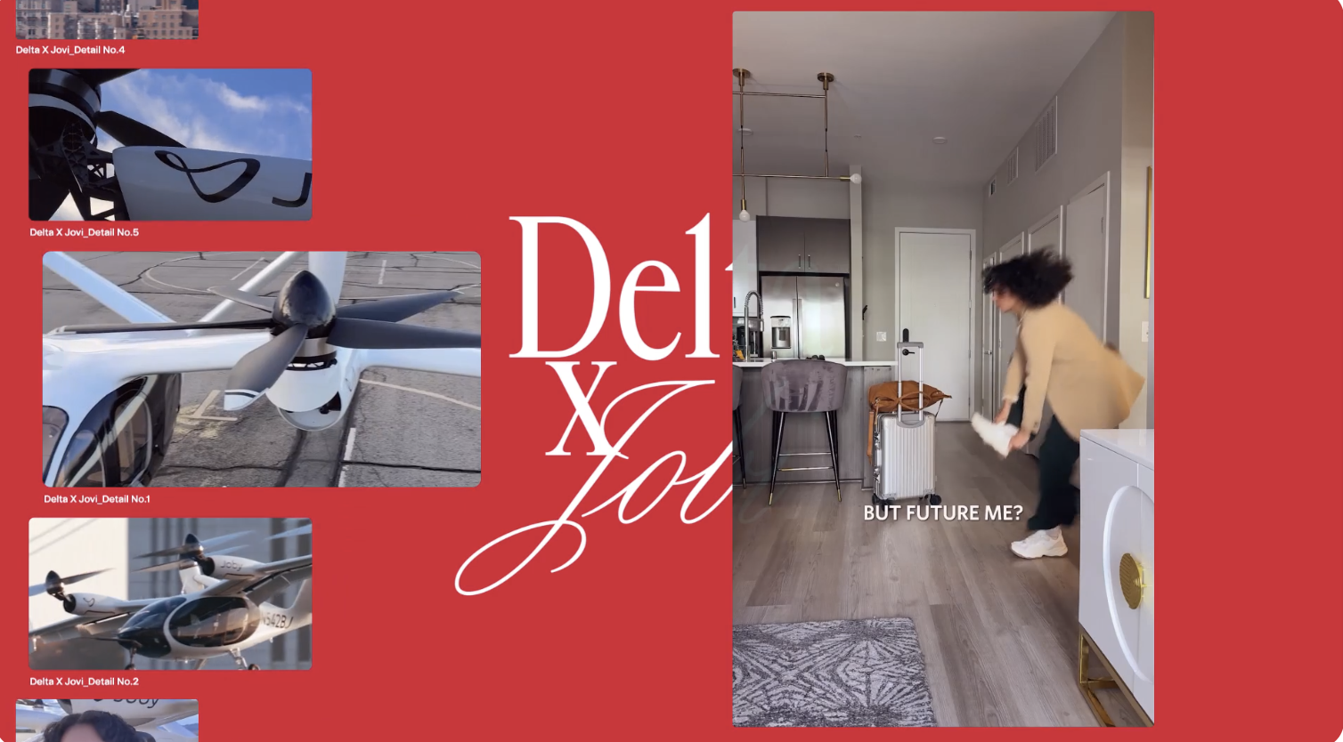
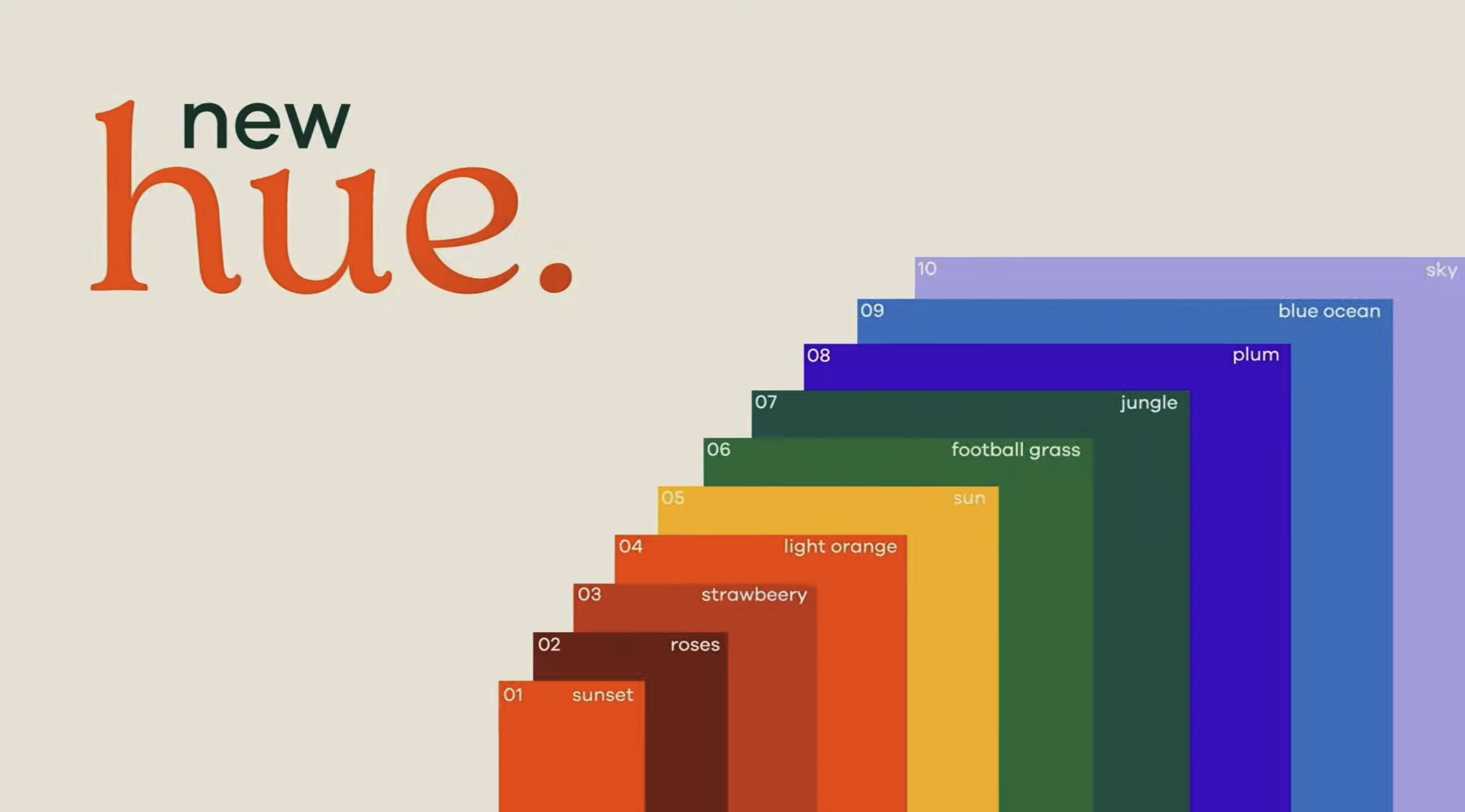
For explainer animations, we want to blend clean stylized typography with clean 2D visuals. Pairing pops of JetBlue’s iconic blue and white with warm background earth tones. Smooth banded animations that pool on and off the screen will blend seamlessly with the cinematography within the frame.
Thank you.
Thanks for your consideration for this project—we look forward to further exploring and developing this story.